Customize the appearance of the player (Android)
An engaging app experience is not driven solely by media and player functionality. In many use cases, you have added a video player to enhance the user's experience of your app -- not to showcase the video player.
You can use the Android SDK to customize the appearance of the player to create an engaging app experience.
Add a branding image
The JWP Android SDK enables you to add a branding image (logo or watermark) to the player.
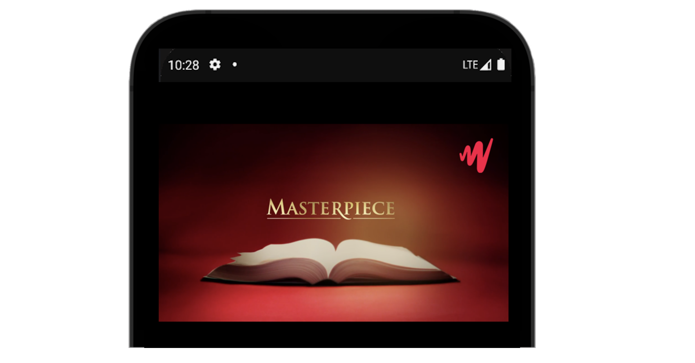
Android screen with a JWP branding logo
- Use
LogoConfig.Builder()to create and name alogoConfigobject. - Define the elements of the
logoConfig. - Add
logoConfigto the player configuration.
LogoConfig logoConfig = new LogoConfig.Builder()
    .imageFile("http://playertest.longtailvideo.com/assets/jw-logo-red-46px.png")
    .webLink("http://www.google.com")
    .position(LogoConfig.LOGO_BOTTOM_RIGHT)
    .fades(true)
    .margin(8)
    .build();

PlayerConfig config = new PlayerConfig.Builder(startupStream.getPlayerConfig())
    .logoConfig(logoConfig)
    .build();
Customize an existing element
Use the following steps to customize an existing UI element:
- Hide the original
JWPlayerUI element. - Build a new custom UI element to replace the hidden UI element.
- (Optional) Hook the new UI element up to the JWPlayer viewmodels to receive events from the SDK.
For unique use cases you can opt to ignore the JWPlayer viewmodels and manually implement event listeners to craft the exact experience you desire for users of your application.
Below is an example hiding a default JWPlayer UI element followed by several examples showing how to replace existing UI elements with custom ones.
Hide specific UI elements
Sample Use Case: Assume you want to hide individual UI elements.
Solution: Use the UiConfig. A UiConfig is attached to every PlayerConfig object that determines if the element will be visible. By default, every player config has a UiConfig with all uigroups set to visible.
JWPlayer mJWPlayer;
// Insert JWPlayer setup code

// Build the UiConfig that will show every UI element but the control bar
UiConfig hideJwControlbarUiConfig = new UiConfig.Builder()
    .hide(UiGroup.CONTROLBAR)
    .build();

// Attach it to the newConfig
PlayerConfig config = new PlayerConfig.Builder()
    .file("http://playertest.longtailvideo.com/jwpromo/jwpromo.m3u8")
    .uiConfig(hideJwControlbarUiConfig)
    .build();

// Load up the player with the config
mJWPlayer.setup(config);
Replace a UI Element with a custom implementation
Sample Use Case: Assume you want to replace a UI element with your own implementation.
Solution:
- Hide the control bar as explained in the Hide specific UI elements section.
- Create a custom control bar.
- Get and add the JW Controlbar ViewModel to the player view.
// Get a handle to the JWPlayerView
JWPlayerView mPlayerView;
// You can pull a reference from the xml if you included it in your layout for the activity
mPlayerView = findViewById(R.id.demoJWPlayerView);

// Pull up a custom control bar view we defined in elsewhere in the codebase
ControlbarView customControlBar = new ControlbarView(this);

// add that controlbar to the playerview and it'll render on top of the JWPlayerView in normal and full screen
mPlayerView.addView(customControlBar);
Connect a custom control bar to our existing viewmodels
Sample Use Case: Assume you want to connect a custom control bar to existing viewmodels.
Solution: Inside the ControlBarView, you can set up listeners to react to events coming from the JWPlayer view. Much of the necessary work has been handled for you by the ViewModel. Each UiGroup has a publicly accessible, associated view model that allows custom implementation without delving into the underlying specifics for different situations.
The following example shows how to set up the custom controlbar to listen to events coming from the Controlbar ViewModel.
// Get a context from the containing activity or wherever is convenient
Context context;

// Get the Controlbar Viewmodel which drives all of the logic behind our control bar
ControlbarViewModel controlbarViewModel =
    (ControlbarViewModel) mJWPlayer.getViewModelForUiGroup(UiGroup.CONTROLBAR);

// Get up an observer that will call a function everytime the isLive variable changes
controlbarViewModel.isLive().observe(
    context,
    //Give a name to the isLive boolean
    isLive -> {
        //Do Something when isLive changes
    }
);

// You can listen to mutiple events at once
// This one will listen for isMuted to change and fire the associated callback
controlbarViewModel.isMuted().observe(
    context,
    isMuted -> {
        // Do something when isMuted changes, like update an icon, or display a toast
    }
);
Customize styling controls
Sample Use Case: Assume you want to change the title text on the overlay screen to an italics text style and 12 dp text size.
Solution: To override styles, you must know the style name. The title text on the overlay screen is defined by Text.Overlay.Title.
<style name="Text.Overlay.Title">
    <item name="android:textSize">@dimen/text_large</item>
    <item name="android:layout_alignParentTop">true</item>
    <item name="android:layout_marginTop">@dimen/margin_large</item>
    <item name="android:layout_marginBottom">@dimen/margin_small</item>
    <item name="android:textStyle">bold</item>
</style>
Updated 6 months ago